Default: Mobile-First Approach
By default, when Crust AI’s AI initially generates your snippet layout in Step 3 (“Make It Perfect”), it prioritizes a mobile-first design. This means the layout is optimized for smaller screens, reflecting the common use case of sharing snippets with users who might be accessing them on the go. The phone preview within the Snippet Builder accurately reflects this mobile-first layout.Adapting for Desktop Views
While the mobile-first layout is functional on desktops, you might want a more optimized arrangement that takes advantage of the wider screen real estate (e.g., using columns, different element sizing). You can easily instruct the AI to create a responsive desktop layout using the AI Prompt in Step 3. A simple prompt can achieve this:Example Prompt: Desktop Responsiveness
Example Prompt: Desktop Responsiveness
Previewing Desktop Responsiveness
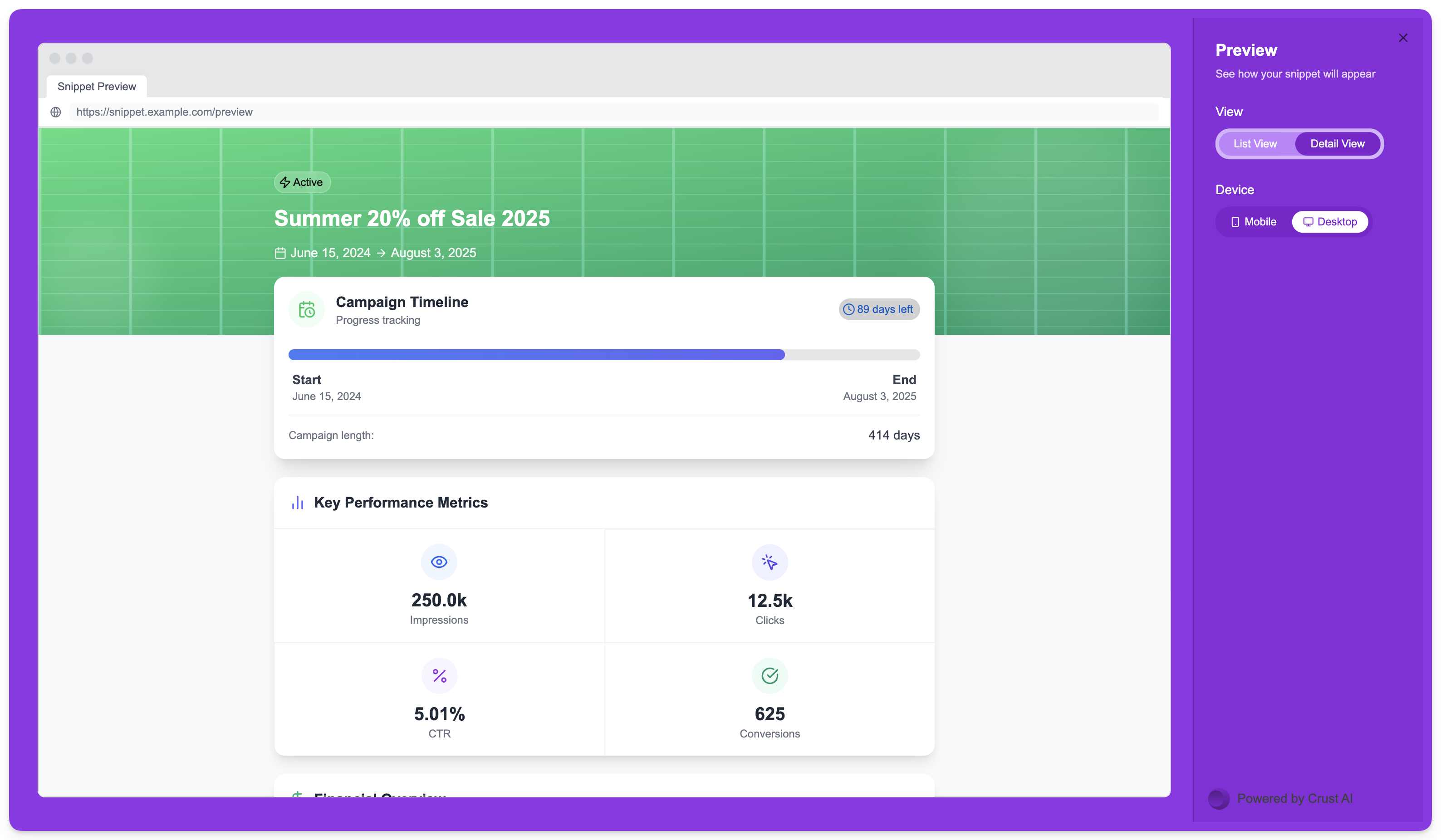
To see how your snippet will look on a desktop computer before sharing:-
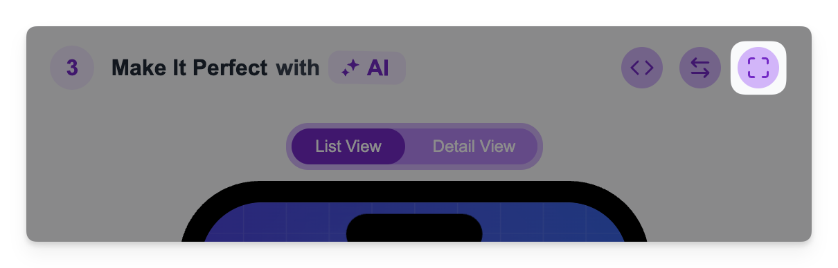
In the Snippet Builder (Step 3), click the Full Screen preview icon in the top right of the builder interface.
-
A larger preview window will open. Within this window, you’ll find options to toggle the preview between Mobile and Desktop device simulations.
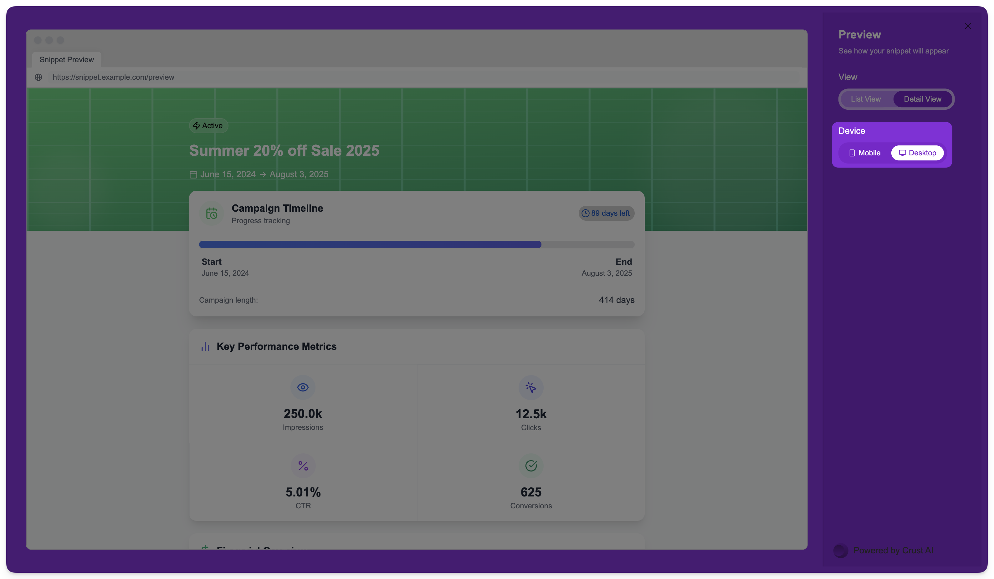
- Select Desktop to see how your current design renders on a wider screen.